
A slide-in mobile menu is an extremely common design pattern. As with most web motifs, there are likely as many methods for implementing it as there are implementations.
However, having made a number of these, I'll lay out my take on how to approach setting one up. Follow along using the code pasted below, or check out the completed demo on GitHub.
Setting up the project
For this tutorial, I'll spin up a small project using Create React App. The principles at work here can be applied across frontend libraries, but my syntax assumes we're working with React.js, TypeScript and CSS modules.
The JSX
If we structure our JSX intelligently, we can make the same markup serve for our menus on both desktop and mobile.
First, I'll create three components:
App
Which wraps everything
const App: FC = () => {
return (
<div className={styles.App}>
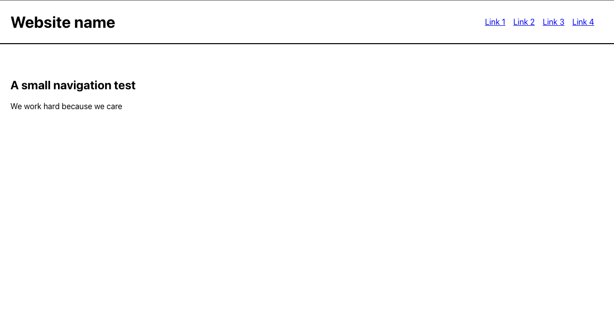
<Header />
<main>
<h2>A small navigation test</h2>
<p>
We work hard because we care
</p>
</main>
</div>
);
}
export default App
Header
Which holds our navigation and website logo
const Header: FC = () => {
    return (
        <header className={styles.app_header}>
            <h1>
                Website name
            </h1>
            <Navigation />
            <ul className={styles.hamburger_toggle}>
                <li></li>
                <li></li>
                <li></li>
            </ul>
        </header>
    )
}

export default Header
and...
Navigation
const Navigation: FC = () => {
    return (
        <nav>
            <ul className={styles.link_list}>
                <li>
                    <a href="#">
                        Link 1
                    </a>
                </li>
                <li>
                    <a href="#">
                        Link 2
                    </a>
                </li>
                <li>
                    <a href="#">
                        Link 3
                    </a>
                </li>
                <li>
                    <a href="#">
                        Link 4
                    </a>
                </li>
            </ul>
        </nav>
    )
}

export default Navigation
Note: The FC that you see after each component declaration comes from TypeScript. It tells the TypeScript compiler that our function will be returning a Functional Component. If you're building this in vanilla Javascript, you can ignore the type declarations.
After applying some basic CSS, our components render looking like this:
Using media queries, I then hide the Navigation component when the user is viewing the app on mobile.
Note that I'm not just slapping 'display: none' on the nav component; instead, I'm using the 'transform' property to pull the navigation outside of the viewport.
@media screen and (max-width: 767px) {
  .main_nav {
    transform: translateX(-100%);
  }
}
Toggling the menu
While looking at the Header component above, you may have noticed some HTML that initially seems to serve no purpose:
<ul className={styles.hamburger_toggle}
  tabIndex={0}
  role='button'>
  <li></li>
  <li></li>
  <li></li>
</ul>
We're actually going to use this to create a 'hamburger' button that toggles the menu in and out. If you're working on a production app, you might want to import an icon to match the site's visual design, but for our purposes we can whip together a simple facsimile using CSS:
.hamburger_toggle {
  display: none;
  list-style: none;
  padding: 0;
  margin: 0;
}

.hamburger_toggle li {
  margin-bottom: 0.35rem;
  border: 2px solid #888;
  border-radius: 25px;
  width: 2rem;
}
I've set the toggle button to 'display: none' by default; we can then add a media query that displays our icon when we're viewing the website on a mobile phone:
@media screen and (max-width: 767px) {
  ...
  .hamburger_toggle {
    display: inline-block;
  }
}
In the Navigation component, you'll notice a similar piece of 'superfluous' markup:
...
<ul
	className={styles.toggle_btn}
    tabIndex={0}
    role='button'>
    <li></li>
    <li></li>
  </ul>
  ...
We'll be using this to create our 'close' button inside the menu.
Note that we've decorated both these components with 'role' and 'tabIndex' attributes. These attributes tell screen readers that we intend the elements to be used as buttons.
Toggling with useState
In order to toggle our menu in and out, we'll employ useState — a React.js hook. A more complex application might house this value in a Redux store, but useState will serve our purposes here.
After importing useState to our Header component, we'll instantiate a variable, 'showMobileNav', that dictates whether or not the menu will display. This variable defaults to 'false' since we don't want the mobile menu to be visible on page load.
import React, { FC, useState } from 'react'
...

const Header: FC = () => {
    const [showMobileNav, setShowMobileNav] = useState<boolean>(false)

    return (
        <header className={styles.app_header}>
            <h1>
                Website name
            </h1>
            <Navigation
                toggle={showMobileNav}
                setToggle={setShowMobileNav} />
            <ul className={styles.hamburger_toggle}
                tabIndex={0}
                role='button'
                onClick={() => setShowMobileNav(!showMobileNav)}
                onKeyPress={() => setShowMobileNav(!showMobileNav)}>
                <li></li>
                <li></li>
                <li></li>
            </ul>
        </header>
    )
}

export default Header
We house mobile nav state in our Header so that it's easy to pass that value to Header's direct child — Navigation.
Having instantiated showMobileNav and setShowMobileNav, we can then pass these values to the Navigation component as props.
Putting it all together
Within the Navigation component, we can now ingest our stateful values as props (I'll specify the prop types for the TypeScript compiler):
type TProps = {
    toggle: boolean;
    setToggle: (order: boolean) => void;
}

const Navigation: FC<TProps> = ({ toggle, setToggle }) => {
    return (
        <nav className={`${toggle ? styles.show_menu : ''} ${styles.main_nav}`}>
            <ul className={styles.link_list}>
                ...
            </ul>
            <ul
                className={styles.toggle_btn}
                tabIndex={0}
                role='button'
                onClick={() => setToggle(!toggle)}
                onKeyPress={() => setToggle(!toggle)}>
                <li></li>
                <li></li>
            </ul>
        </nav>
    )
}

export default Navigation
Now that we have our 'toggle' value inside of Navigation, we can use that value to attach a conditional class to the component whenever 'toggle' is truthy.
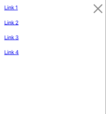
Whenever the user presses the hamburger button inside the Header component, the Navigation component will receive that information. We can now use CSS to pull a re-styled nav menu into the viewport, using the 'transform' property:
@media screen and (max-width: 767px) {
  .main_nav {
    transform: translateX(-200%);
    position: fixed;
    top: 0;
    left: 0;
    width: 100vw;
    height: 100vh;
    background-color: white;
    padding: 1rem;
  }
  .link_list li {
    display: block;
    margin: 0 0 2rem 0;
  }
  .link_list li a {
    font-size: 1.25rem;
  }
  .show_menu {
    transform: translateX(0%);
  }
  .toggle_btn {
    display: inline-block;
  }
}
Much as I did with the 'hamburger' button in the Header component, I'm going to use CSS to manipulate a 'ul' within the Navigation component and give us our 'times' icon, which we'll use to close the menu:
.toggle_btn {
  position: absolute;
  right: 1rem;
  top: 2rem;
  list-style: none;
  margin: 0;
  padding: 0;
}

.toggle_btn li {
  width: 2.5rem;
  border: 2px solid #888;
  border-radius: 4px;
  position: absolute;
  top: 50%;
  right: 50%;
  transform: translate(-50%, -50%) rotate(-45deg);
}

.toggle_btn li:first-of-type {
  transform: translate(-50%, -50%) rotate(45deg);
}
At this point, we should be able to put these components together and have a functioning mobile menu.
Adding a little pizzaz
We have our toggle logic working, so now let's add the 'slide' part of this sliding menu.
Since we're manipulating our 'nav' component in order to show and hide the menu, let's go to its associated CSS in order to add an animation.
Using CSS's 'transition' property, we can animate whenever we pull the menu into or out of the viewport:
.main_nav {
    ...
    transition: 0.3s transform ease;
  }
This animation looks pretty good, but we can make it "pop" a little bit more by animating the menu's opacity at the same time:
.main_nav {
    ...
    opacity: 0;
    transition: 0.3s transform ease, 0.3s opacity ease;
  }

 ...

 .show_menu {
    transform: translateX(0%);
    opacity: 1;
  }
And that does it
Thanks for reading along. Let me know if you have questions or know of ways in which it can be improved